My work across Architecture, UX, and Spatial Design is driven by onequestion: How can this change the way someone understands and connects with their environment?
scroll to see the work
My Projects
Other Work
Class projects, studio work, and the art I make outside of design.
Design and architecture
Healthy Recipe App
UI design
Mobile
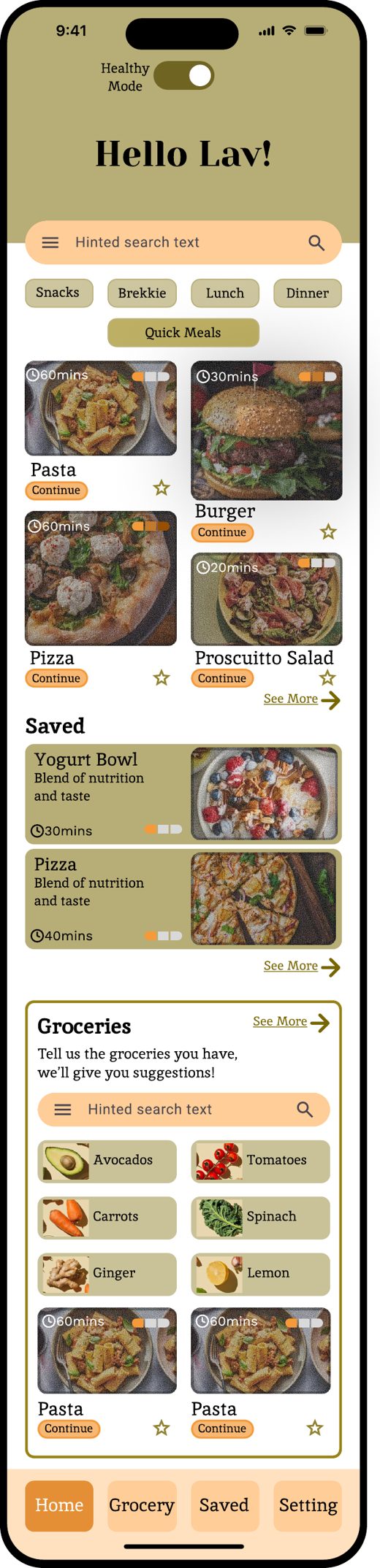
The home page of a recipe app for easy, healthy recipes, with a Healthy mode toggle and a groceries tool that suggests meals from what you already have. This was mostly a UI design project, built on Gestalt principles and a 4-column grid.
StudyConnect
UX design
Web
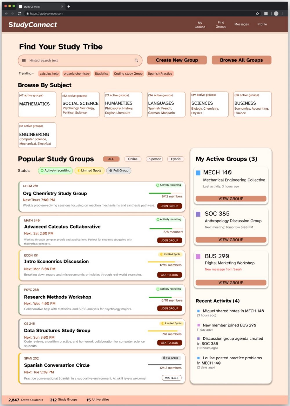
A website that helps college students find and join study groups. I took it from content maps and lo-fi wireframes to a high-fidelity design.
GroundWorks
Architecture
Team project
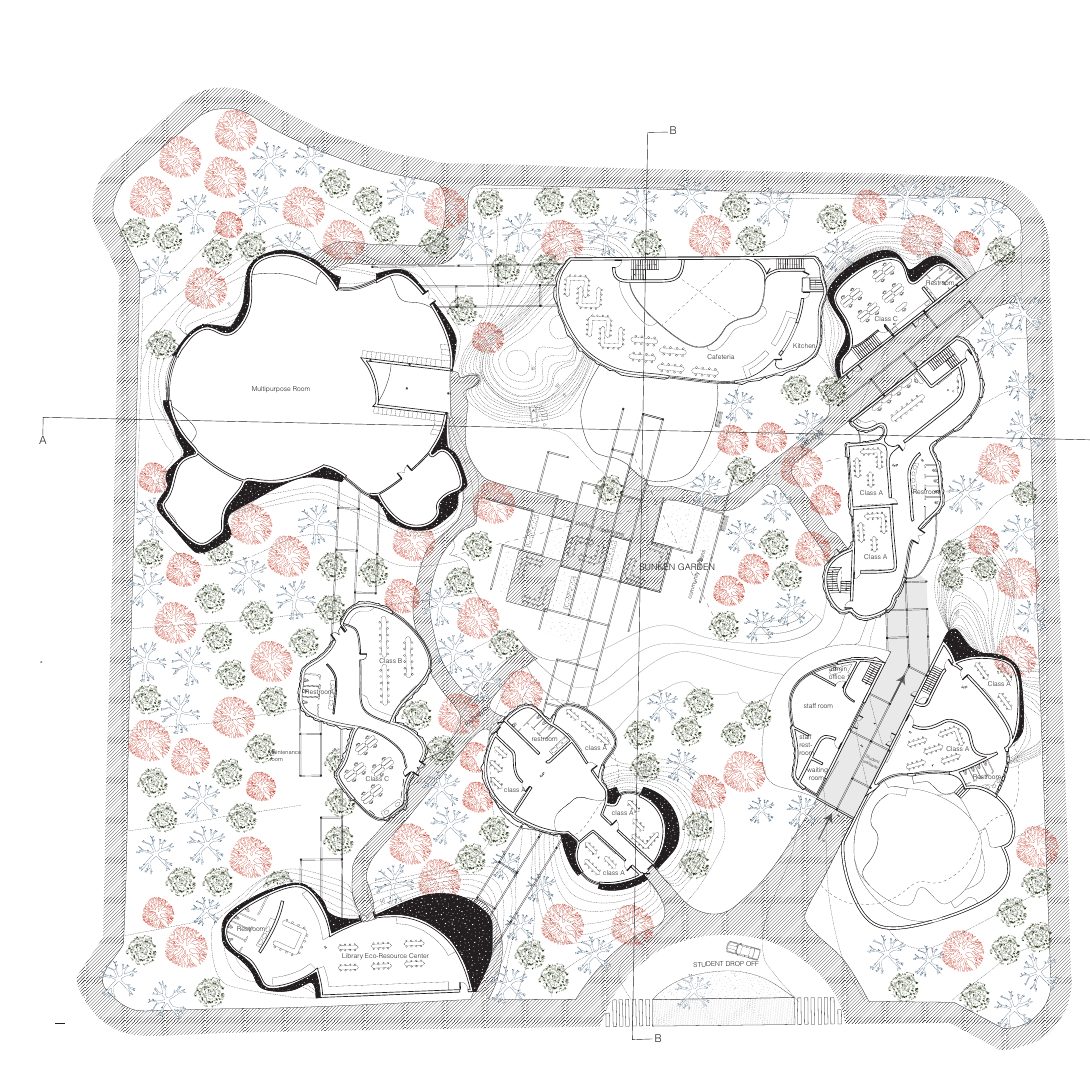
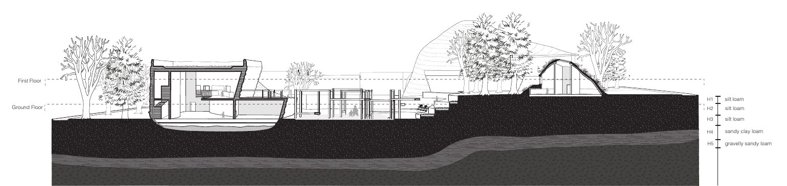
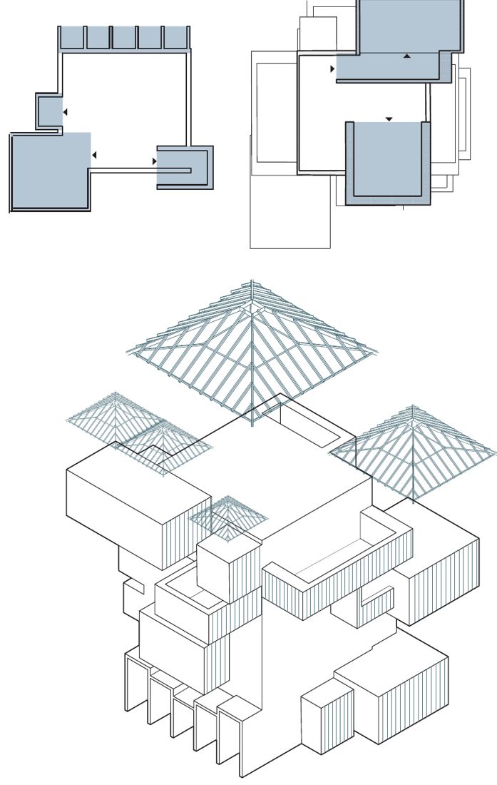
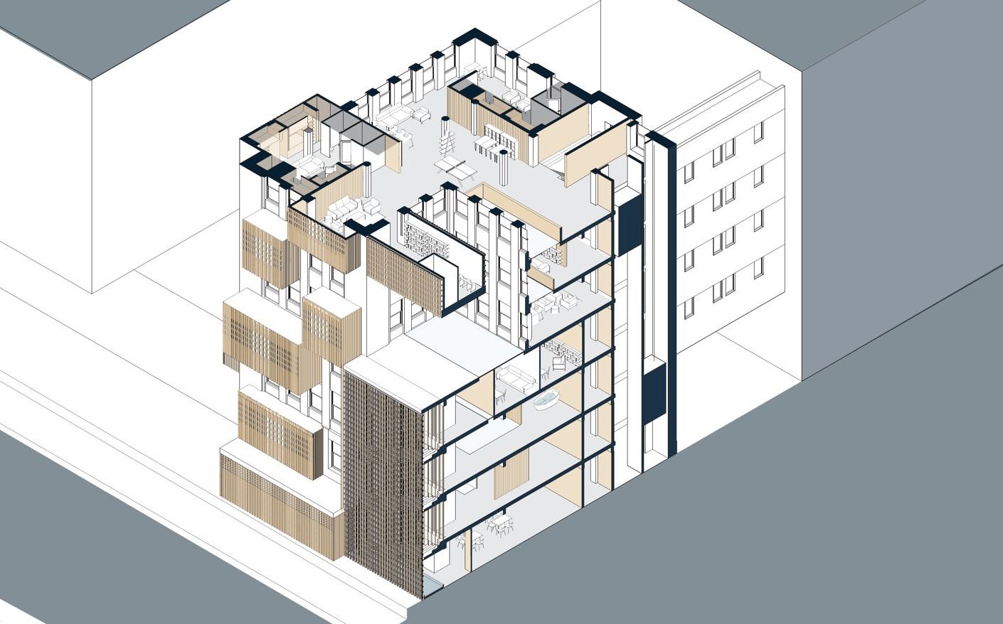
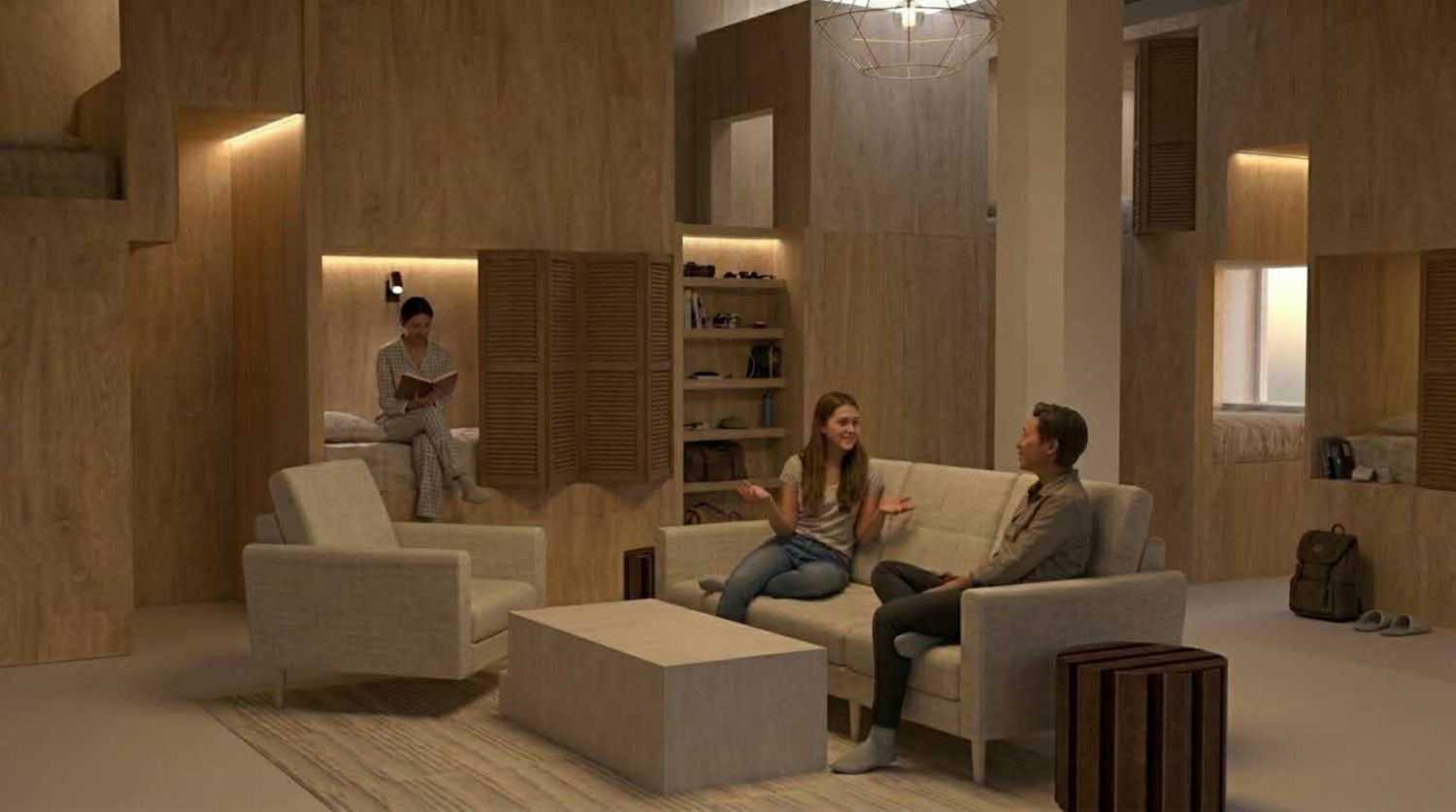
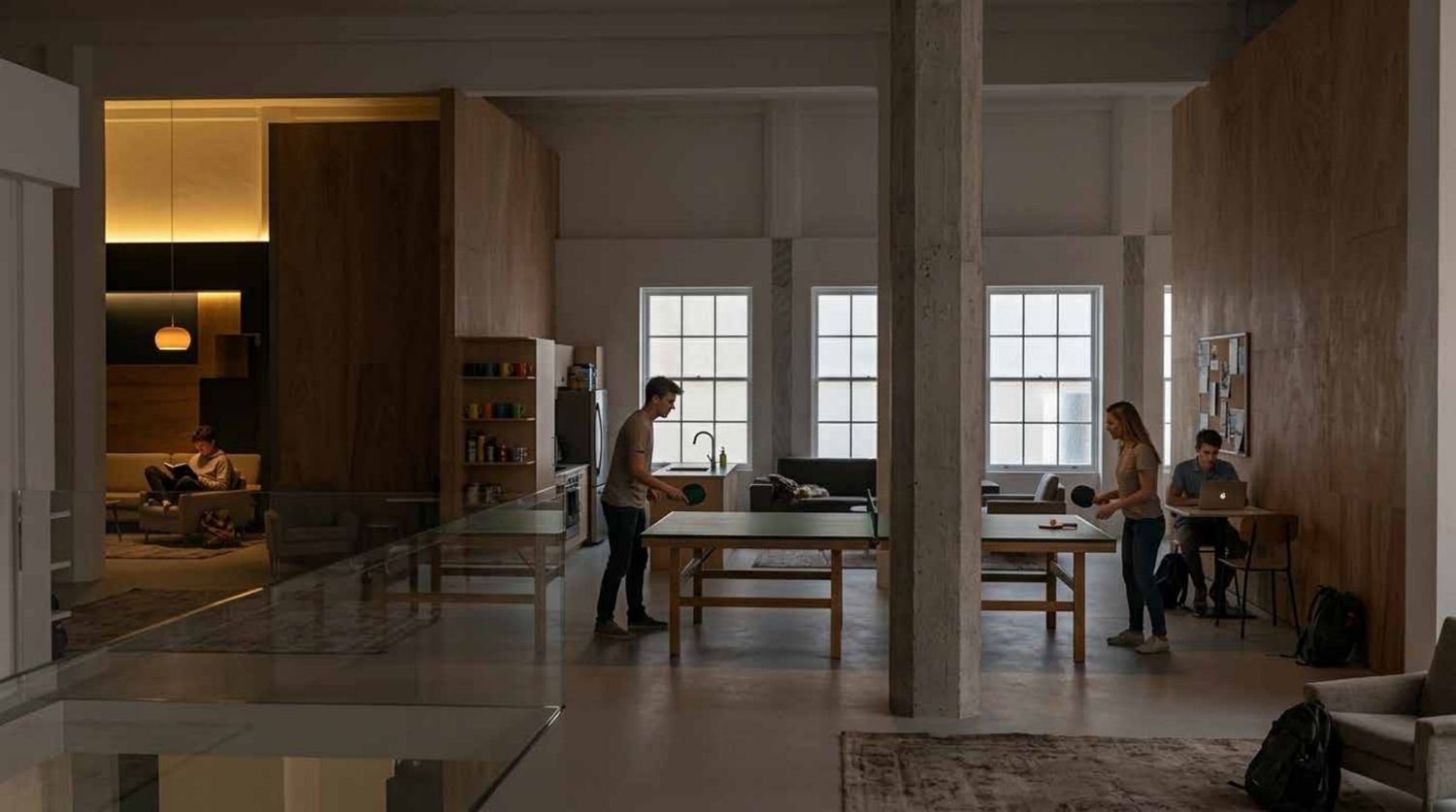
An environmental middle school in Lawrenceville, Pittsburgh, that uses rewilding to help children explore ecology while opening green space to nearby families. Designed with my partner Marra Storey in Poiesis III, Fall 2025.
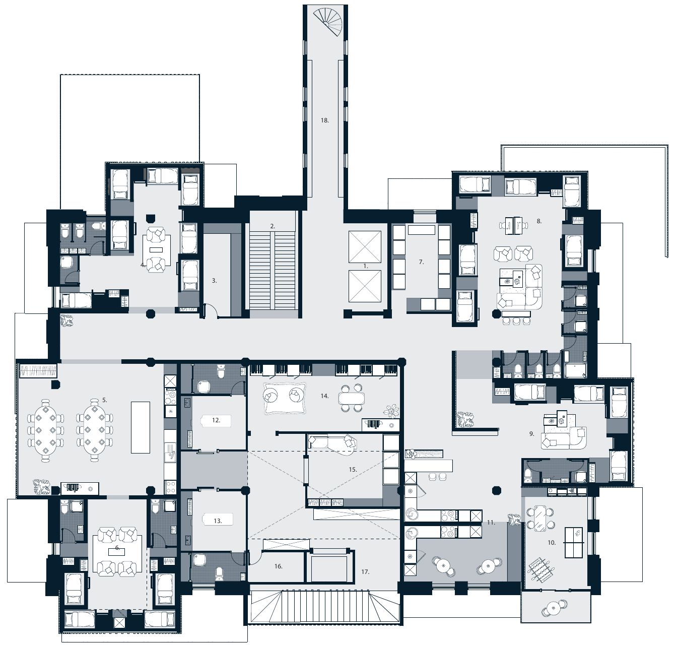
First floor plan and Section A
Art
Behind the Door
A door painted with my loved ones that opens onto a black hole, about the things we all keep locked away. At my school, people anonymously wrote down what they hide so the black hole could carry it away.
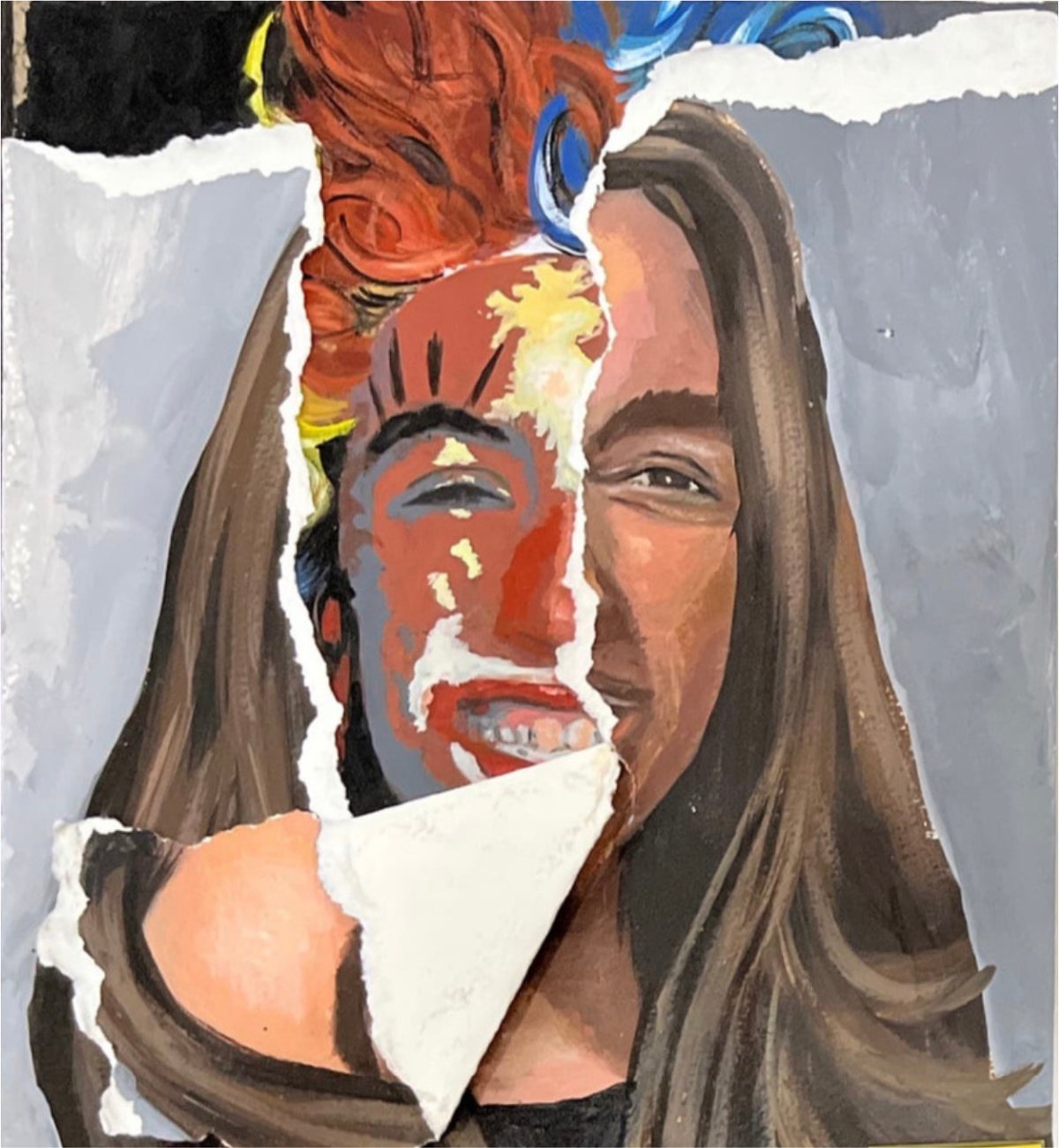
Underneath
A self-portrait where tearing away the current me reveals the free, younger me underneath, grinning even dressed as a clown.
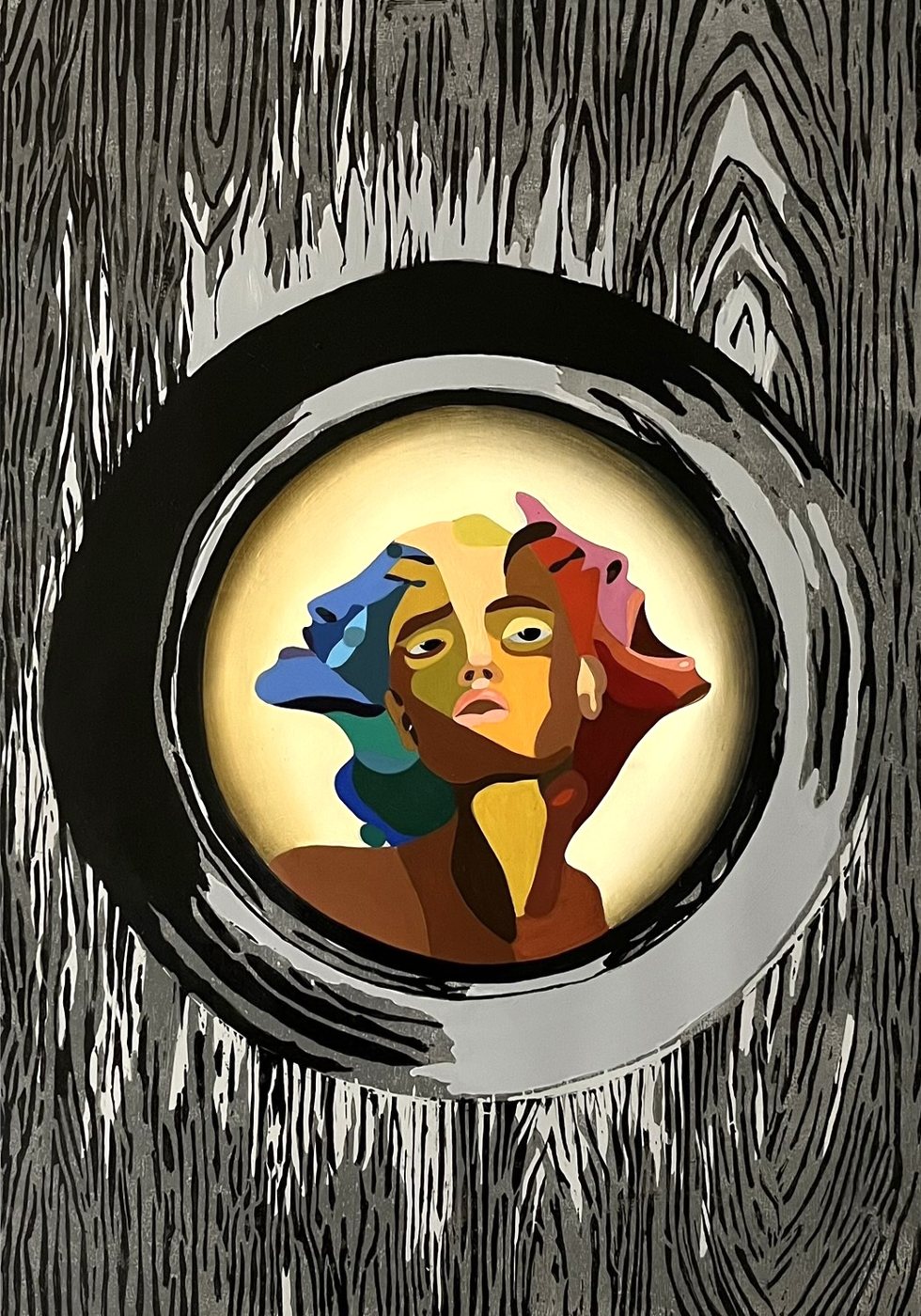
Keyhole
Acrylic paint and lino print showing a keyhole view into ourselves, with all our emotions mixed together.
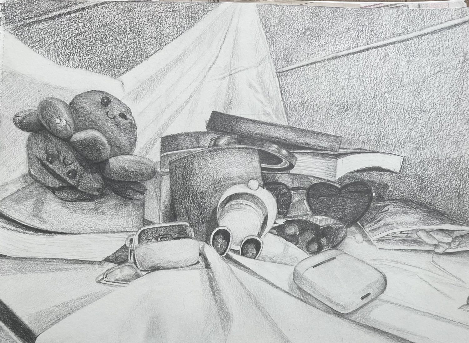
Everyday Objects
A pencil sketch of everyday objects. Not perfect, but just right.
An e-book aggregator concept that helps Indian digital readers find any book, in the format and language they need, across a fragmented set of platforms.
Timeline
June to July 2026
Role
UX Design Intern
Methods
UX research, UX and UI design
Tools
Figma, AI Workflows
Context
EY Summer Internship 2026
The problem
Readers know which book they want but can't tell which platform carries it, so they give up or turn to piracy.
What I did
Secondary research, a 50-person survey, 4 stakeholder interviews, empathy maps, and 2 personas.
The result
A unified search concept with price, format, and language comparison, backed by an IA, task flows, wireframes, and a high-fidelity discovery page.
01
Introduction
Problem statement
Indian digital readers struggle to discover and access e-books across India’s fragmented platform ecosystem. They spend excessive time searching multiple platforms, often resorting to piracy because they do not know which platform carries the book they want or in the format they need.
Root cause
Lack of discoverability within India’s fragmented e-book ecosystem.
Primary target
Indian readers with access to the internet and devices.
02
Discovery
I started with secondary research to understand the reality of the market in India and worldwide, then moved to surveys and interviews for first-person experiences. Combining the two led to empathy maps and personas.
Secondary research
The Indian e-book market is growing fast. E-books made up 15% of total book sales in India in 2022, up from 5% in 2018, and the market is expected to grow at more than 6% CAGR from 2024 to 2029. Behavior matters more than demographics: purchase intent and brand engagement predict e-book buying better than income or age.
E-books published in India each year, 2016 to 2025
Source: Debnath (2025), from ISBN metadata. Publishing jumped in 2020 and kept growing after the pandemic instead of levelling off.
Where existing platforms fall short
Amazon KindleSupport for Indian languages has been inconsistent in typography, discoverability, and experience. KDP only accepts Indian language content as Word files.
PratilipiHard to navigate and browse. You need to already know what you're looking for.
StorytelHosts regional languages, but is difficult to use in them.
Juggernaut BooksA homegrown publisher backed by Airtel that has not developed much since 2016.
Google Play BooksPer-title purchases only, a limited regional catalogue, and mainly convenient for Android users.
Primary research
A survey of 50 people (68% aged 18 to 24, 88% from North India) showed that the books people want usually exist digitally. Finding them is the hard part.
50%start their search on Google, not an e-book platform
35.7%have to search across multiple platforms to find a book
50%can't read a book because they can't find it in a digital format
80%think an e-book aggregator would be useful
I then ran four interviews, each with a different stakeholder: a reader who prefers e-books, a reader who prefers paperbacks, a physical bookstore (Bahrisons), and a reader who uses piracy. These narrowed the audience to two groups: the Digital Reader and the Piracy Digital Reader.
Empathy maps
Click to enlarge.
Personas
The Digital Readers: know what they want, just need to find it.The Piracy Digital Readers: want fair prices, quality, and less time wasted.
Key insights
Discovery is fragmented. Half of readers start with Google, not a dedicated e-book platform.
The platform loyalty paradox. Kindle dominates, yet many readers still download PDFs manually, often through piracy.
Language and format matter. Readers lack clarity on formats, and regional books are hard to discover.
Piracy is a UX workaround. People turn to it for convenience, not only cost.
Discovery is social. Recommendations from friends and social media matter more than platform suggestions.
Search friction is real. 35.7% search multiple platforms, and 33.3% only find a book after extra effort.
03
Dream
The solution
Book Stop is an e-book aggregator that brings together the fragmented Indian ecosystem (Kindle, Google Play, Apple Books, and regional sources) and offers:
A single, unified search across all platforms
Real-time price comparison and format availability
Multi-language and multi-format filtering
Social discovery through friend recommendations
Direct links to buy or access books on the original platforms
Design principles
Simplicity first. Instant results across platforms.
Transparency. Clear pricing, format, and language information.
User control. Filters and custom searches that match each reader's preferences.
Information architecture and task flows
Structure
Main navigation covers search, home, library, friends, account, and a help center. Search includes a chatbot, each book page compares prices, formats, and languages, and the library holds saved books, a wishlist, and reading history.
Task flows
Three to-be flows: discovering a book, first-time onboarding, and finding friends.
I sketched the search, discovery, and book pages on paper first, exploring a carousel for recommendations and rows for trending books and friends' picks. I then turned the discovery page into a first low-fidelity wireframe.
Paper: search and book pagesPaper: discovery pageLow-fidelity discovery page
04
Design
This is a high-fidelity design of the Book Stop discovery page, where readers start their search. It brings the research into one screen: a single search across every platform with format filters, picks matched to your reading with the platform and price shown upfront, top 10 lists by category, and books your friends are saving.
Discovery page: one search across every shelf, and picks matched to your reading.Each pick shows where to get it and for how much, followed by top 10 lists and your Reading Circle.
The research showed that readers don't need more books. They need a clearer path to the ones that already exist. The low and high fidelity wireframes are a first attempt and require more iteration on my part, and I'll keep developing Book Stop as I learn more about UX design.
Sources
Debnath, Avijit. “Linguistic Diversity in Decline: A Data-Intensive Study of Indian Book Production Trends 2016–2025 via ISBN Metadata.” ResearchGate, 2025.
MAPSystems India. “eBooks in 2026: Advantages and Disadvantages Explained.” MAPSystems, 2026.
Tracxn. “E-Book Companies.” Tracxn.
Spjeldnæs, Kari, and Faltin Karlsen. “How Digital Devices Transform Literary Reading.” New Media & Society, vol. 26, no. 8, 2024, pp. 4808–4824.
“Rise and Acceptance of eBooks: A Comprehensive Study.” ResearchGate.
Henriksen, Oscar. “India Publishing Industry Statistics.” Worldmetrics, 2026.
BookMandee. “How India Reads: Insights from Surveys, Data, & Online Behaviour.” BookMandee, 2025.
National Digital Library of India (NDLI). Accessed June 26, 2026.
Bookishelf. “The Impact of eBooks on Reading Habits.” Bookishelf.
Tripathi, Sachin, et al. “A Machine Learning Approach to Consumer Behavior Analysis in Social Media-Influenced E-Book Markets.” Journal of Applied Science and Technology Trends, vol. 6, no. 2, 2025, pp. 242–250.
An adaptive interface for the Transit app that learns your daily routine and reduces friction points in your everyday commute by reducing the number of screens and predicting possible interferences.
Timeline
Fall 2026, 3 weeks
Team
Group of 6
My role
Ideation, user adoption, and AI prototyping
Course
Design of Artificial Intelligence Products
Tools
Figma, Figma Make, Google Stitch, Claude Code
The problem
Routine riders search for the same trip again and again, and when a bus is late or full, they have to start over.
What I did
Found the opportunity from my own commute, led ideation, worked on user adoption, and prototyped with AI tools.
The result
A two-tap routine trip, live alerts with one-tap switching, and a business case for why Transit should build it.
01
Introduction
Every weekday, I open Transit to get to campus. I tap "Where to?", search for the same place I searched for yesterday, scroll through the routes, and pick the bus I always take. It's four or five steps for a trip I do every single day. If the bus is late or too full to stop, I back out and do it all over again.
Our brief was to find an Adaptive UI (AUI) opportunity. An AUI learns from what a user already does over and over and helps them do it faster. The brief ruled out recommenders: the system can't suggest something new, it can only enhance something the user already does.
This was a 3-week group project with a team of six, for the course Design of Artificial Intelligence Products.
Current Flow: finding the same bus every day in the current Transit app.
02
Discovery
Each of us brought two AUI ideas to the team. Mine were for Shazam and for a book app. As a group, we filtered out anything that was really a recommender in disguise, which turned out to be most of our first ideas. We started with Uber and the idea of surfacing frequent destinations. That led me to bring up Transit, because I use it daily and had noticed the gap myself.
Mapping the opportunity
The triggerOpen app, tap "Where to?", scroll or search, pick the destination, choose a bus line.
The inferenceBased on your location, the time and the day, the app predicts where you're going.
The dataTransit already has user trip history, location, and live transit data.
The cost of being wrongA wrong guess costs one glance. A missed guess means you see the normal app.
4 to 6times a day, Transit riders open the app
77.1%of route-checking sessions involve only one route
67.9%of transit pass holders already plan trips on their phone
Routine riders keep searching for the same trip, and they already plan on their phones, so the feature asks for no new behavior.
Testing with peers
To check the idea, we tested our wireframes with five peers from another team. Most of them had the same problem. Their main feedback was to look for other moments of friction. That is how we found the second half of the project: what happens when your bus is late or too full to stop.
03
Dream
The One Rule
Our aim was not to change the entire interface, but to consolidate what the app already knows. Delays, crowding and alternative routes are all information the app already has. Our job was to bring it forward at the right moment instead of making riders go looking for it. We also kept Transit's design language and left every original screen reachable, so the adaptive layer feels like part of the app and anyone who prefers the old flow can still use it.
Designing for when the AI is wrong
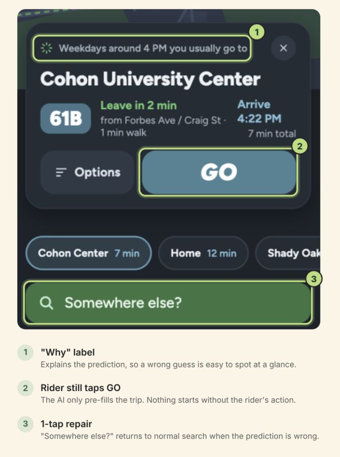
Wrong suggestionA "why" label ("Weekdays around 4 PM you usually go to...") makes the mistake easy to spot, and "Somewhere else?" opens the normal search so users can ignore the suggestion if needed.
Missed routineThe rider sees the normal home screen. In the worst case, it's the same experience as today.
Wrong alertAll actions are taken with confirmation from the user, the AUI never automatically changes the route.
The why label, a single GO, and a one-tap way out.
Prototyping with AI
To prototype quickly, my teammates and I gave the same prompt and screenshots to three AI tools: Figma Make, Google Stitch, and Claude Code. I worked on the Figma Make version.
Comparing them showed us a lot about these tools. Figma Make kept drifting away from Transit's original look, Stitch packed in too much information, and Claude Code gave the cleanest result to build from.
One of the early AI-generated prototypes we compared.
04
Design
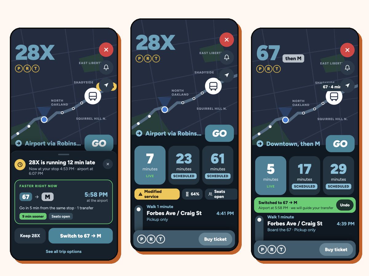
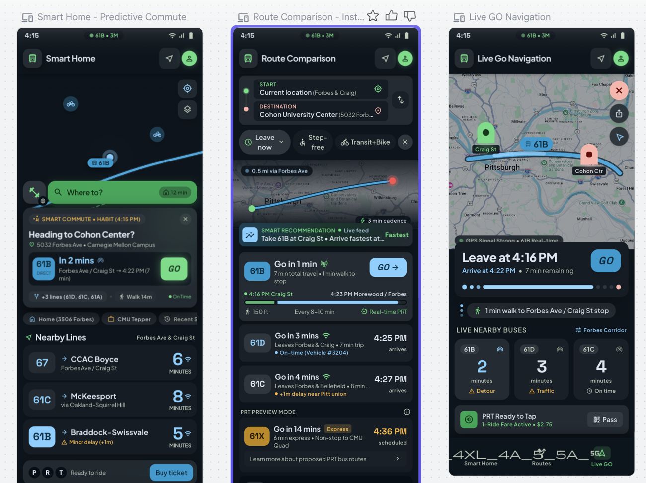
With the AUI: your trip is waiting on the home screen, and a delay alert lets you switch buses in one tap.
Routine tripWhen you open the app at your usual time, your trip is already on the home screen with the right bus and a single GO button. The trip goes from four or five steps to two taps.
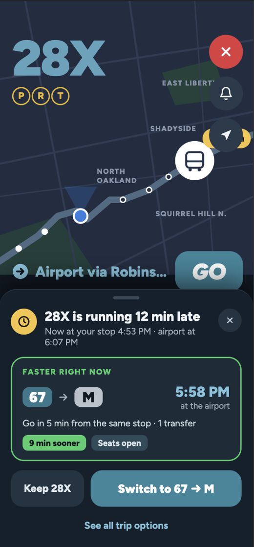
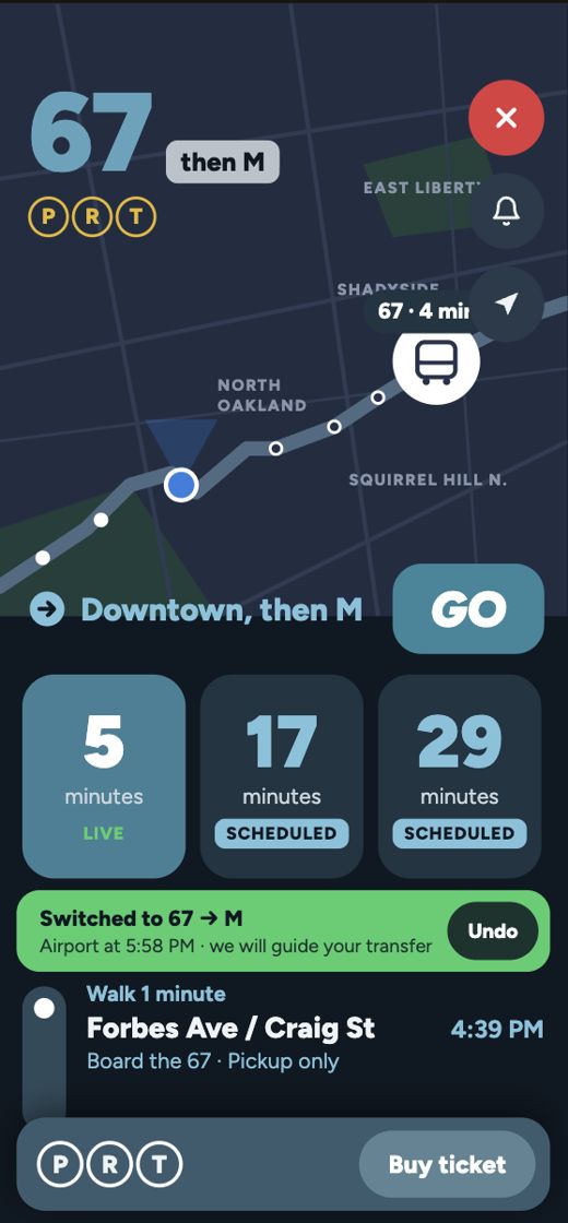
Delay predictedIf your bus is running late, the app offers a faster option right on the ride screen. You can switch with one tap, keep your bus, or undo.
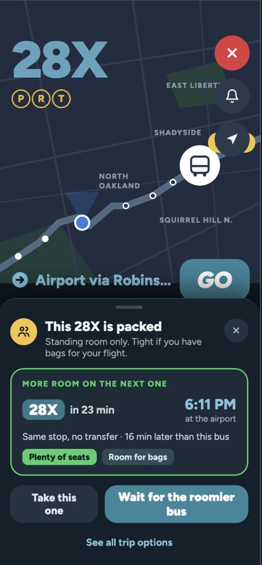
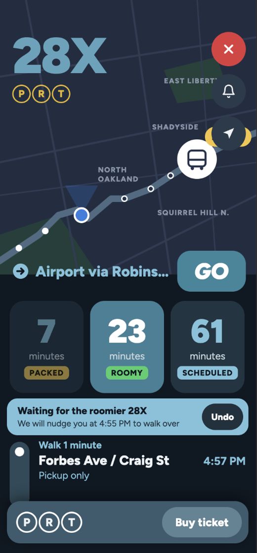
Packed busIf your bus is predicted to be full, the app suggests waiting for a roomier one. That matters for someone heading to the airport with luggage.
Delay predictedSwitched with one tapPacked bus predictedWait for a roomier bus
The business case
Good UX alone rarely convinces a company to build something, so we also made the case for why Transit should invest.
Technical feasibility
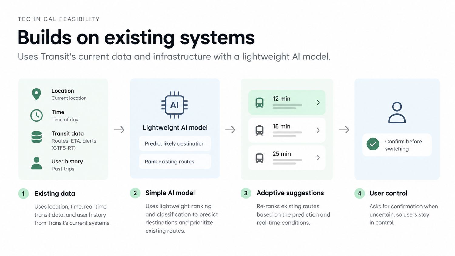
The feature builds on Transit's existing trip planner and real-time data, with a lightweight ranking model rather than a complex AI system.
Financial viability
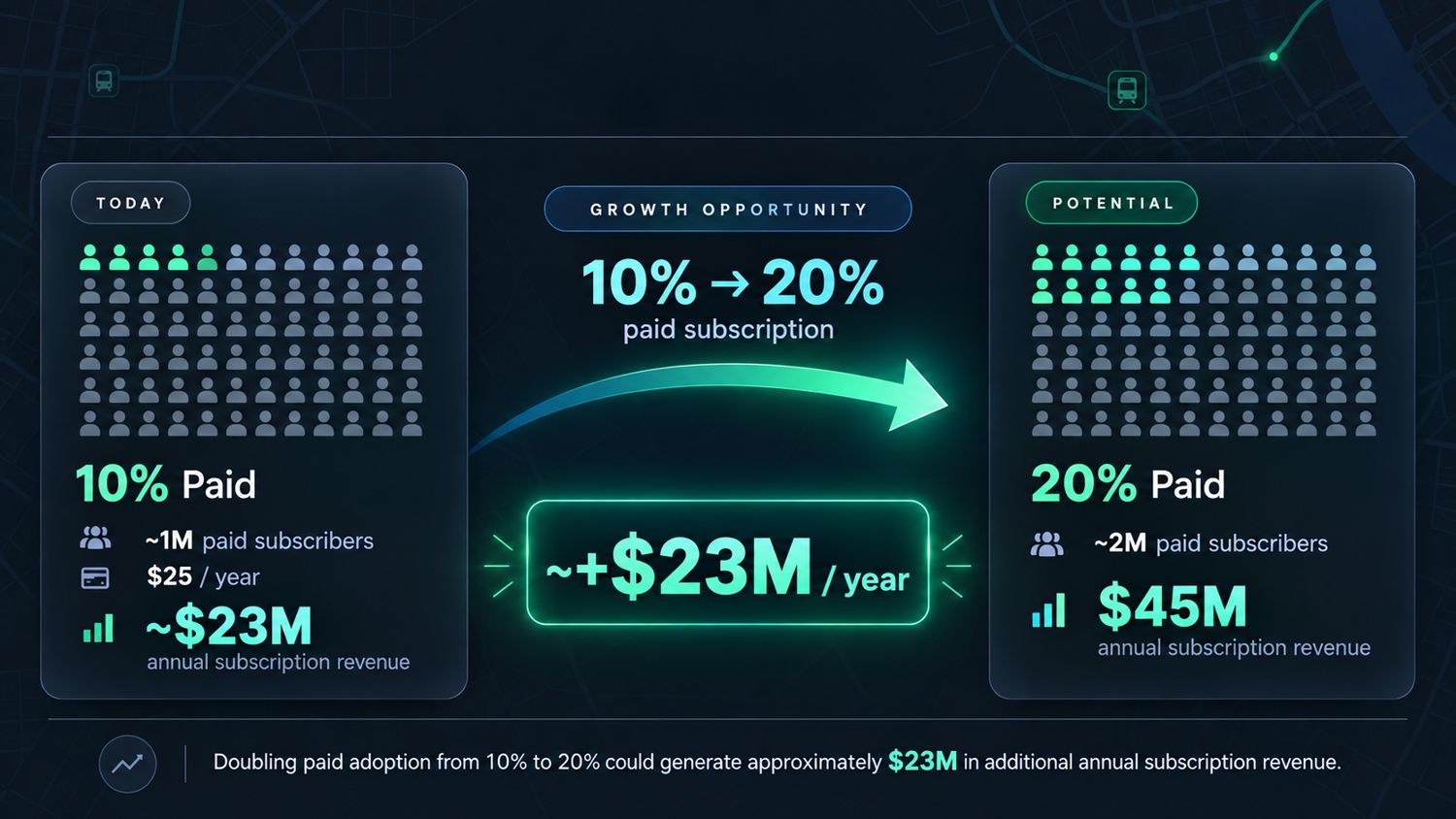
Transit earns money partly from paid subscriptions. Using about 9M users, 10% paid adoption and a $25 yearly subscription, each extra point of paid adoption adds about $2.25M a year.
Technical feasibility slide from our pitch.Financial viability slide from our pitch.
These numbers are our own modeled estimates based on public assumptions, not Transit's real figures, and may not be fully accurate.
Reflection
During our first 5 minute presentation, a feedback round, our professor asked us ‘So what would your AUI actually do’, that’s when we realised we’d spent so long investigating the problem itself, that we hadn’t properly explored the solution. So we then spent the next 1.5 weeks working towards solidifying our solution so it would actually help transit users. That’s when we expanded past just daily routines but also looked at other friction points within the app and realised the late and full bus scenarios were true pain points.
Even though this project taught me a lot about the capability and advantage of AUIs, another important learning was that sometimes the rules of a brief make you shut ideas down too early, and the better move is to find a way to make them work within the rules.
An adaptive reuse architecture project of a vacant Heinz factory building on Pittsburgh's North Side. Bringing together residential and commercial spaces with the concept of a ribbon.
Timeline
Spring 2026, 3 months
Role
Solo Designer
Course
48-205 Unlikely Hybrids
Tools
Rhino, Illustrator, Photoshop, Rendair AI
The challenge
Reusing an abandoned structure to create a hybrid of two different spaces: a public bathhouse and private residential space.
A key aspect being integration into the environment and community
What I did
A site visit, historical research on Allegheny City, conversations with Pittsburgh residents, precedent studies, physical models built to scale, and a full design from plans to renders.
The result
A bathhouse and a traveler's hostel woven together by a continuous ribbon-like wall, growing both horizontally and vertically to mold space.
01
Introduction
The studio brief was adaptive reuse where we had to turn an existing building into an "unlikely hybrid" of a bathhouse and a type of housing. My building was the former administrative annex to the main admin building of the Heinz factory on Pittsburgh's North Side.
While the bathhouse was set by the brief, I had the liberty to choose housing styles and I chose a hostel. My research showed me that Pittsburgh's history is much richer than most visitors realize and I wanted to give people an affordable reason to stay close to the parts of the city that are growing right now: the Heinz area, the Strip District, and the bridges.
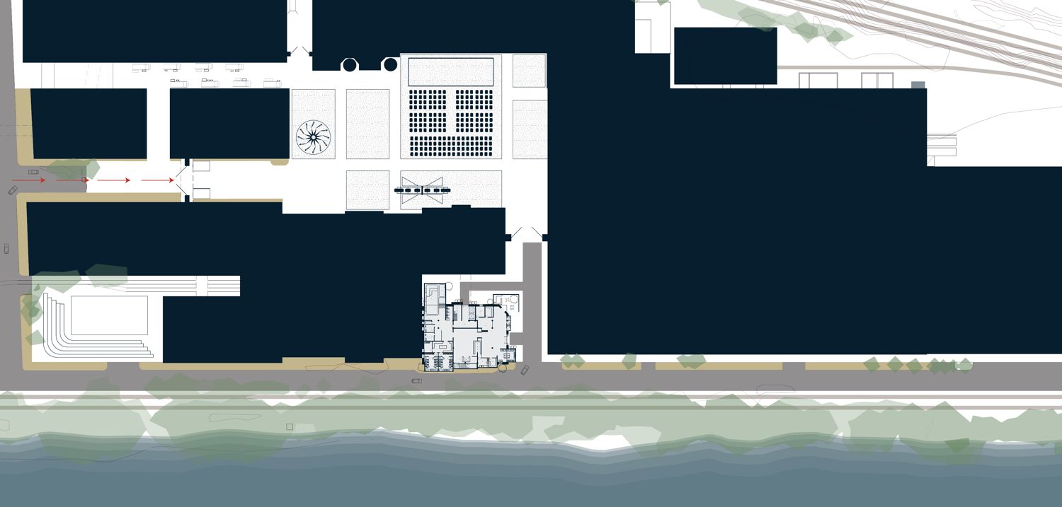
Site plan of the annex and its surroundings.
02
Discovery
I started on the site itself. I visited the building, walked the surrounding area, and spoke with Pittsburgh residents about the history of the Heinz factory. I also visited the Senator John Heinz History Center to learn more about the environment my project was placed in.
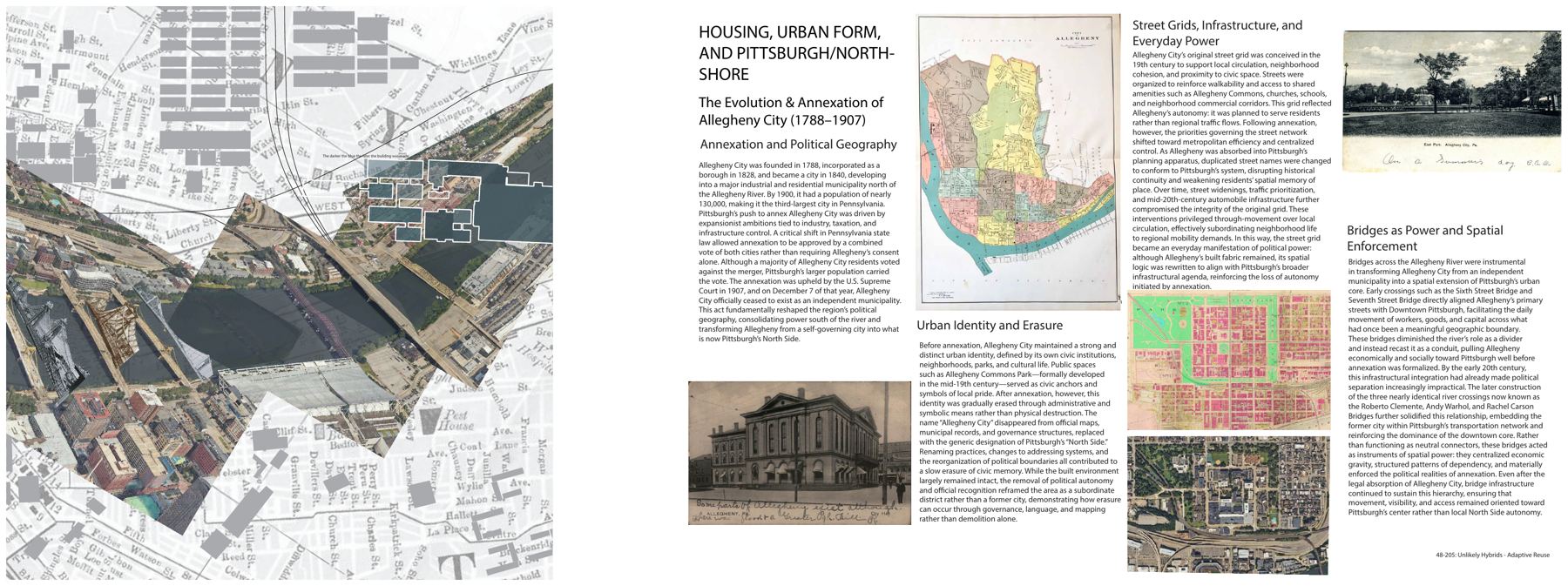
Alongside that, I researched Allegheny City, the independent city that was annexed by Pittsburgh in 1907 and became what we now call the North Side. Its bridges, including the Three Sisters, slowly pulled it toward downtown, and its name and civic identity faded through renaming and remapping rather than demolition. Two things stood out:
People are losing the history of Allegheny City within Pittsburgh.A cheap, central place to stay while you visit could help change that.
Bathhouses used to be shared community spaces.That culture has mostly disappeared but bringing one back brings back a kind of public space the city has lost.
My research board and site collage.
Precedents
I studied two precedents to supplement my design process:
Trenton Bath House by Louis Kahn
From this design, I learnt the intricacy of dividing the served and servant spaces seamlessly. It showed me the importance of the division of space without the user feeling the division.
Mini House by Atelier Bow-Wow
Through this precedent I learnt the importance of utilizing vertical space and extrusions. Instead designing around constraints like compact space.
My precedent hybrid, combining the two into the starting point for my design.
03
Dream
The key question was how a public bathhouse and a private hostel can share one building without interfering with each other's lives.
The ribbon
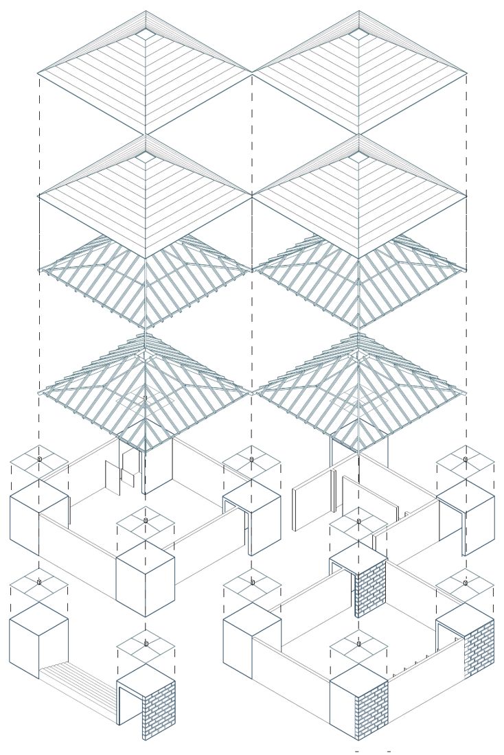
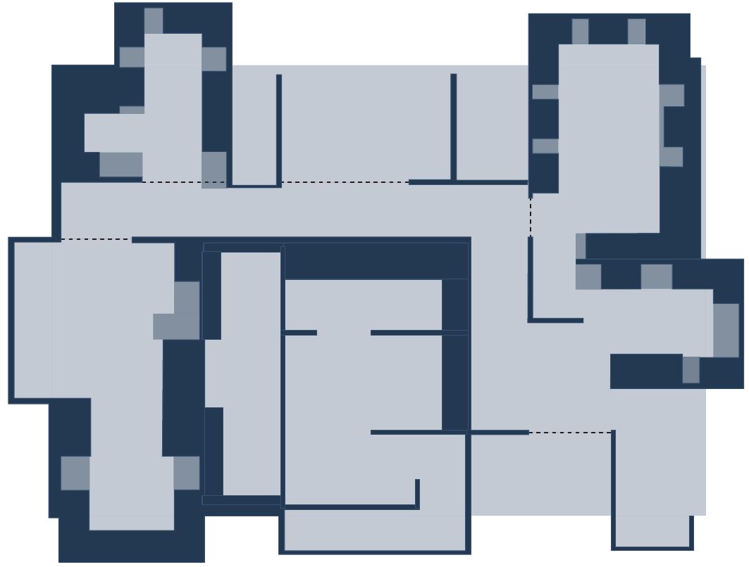
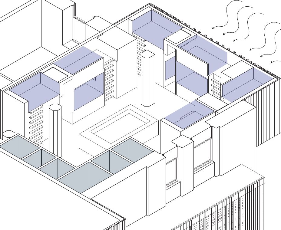
My answer was the ribbon. It is one continuous wall that weaves in and out of the existing building, creating space wherever it's needed. Horizontally, it divides the rooms and separates the two programs. Vertically, it folds to form the hostel's sleeping pods. It shows how residential and commercial space can work together in one building.
Ribbon diagramUnit isometric: the ribbon forms the sleeping pods.
Two programs, one building
The bathhouseTakes the ground floor and part of the first four floors. Its entrance faces the road, so it's easy for the public to reach.
The hostelTakes the rest of the building. Its entrance is on the other side, with its own reception and its own lifts.
They share a wall, not a doorway.Hostel guests can use the bathhouse, but the public never passes through the hostel.
I also proposed turning the empty lot behind the building into a festival and carnival space for events, giving travelers a reason to come and bringing more activity to the North Side.
04
Design
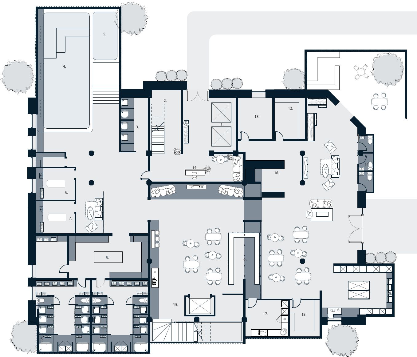
The bathhouse includes a main pool, a hot tub, two treatment rooms, locker rooms, a juice bar, a gift shop, two meditation rooms, a light room, and a reading and tea room.
The hostel floors are organized around shared living: four units of sleeping pods, two common kitchens, a dining room, a library and laundry.
Ground floor planResidential floor plan
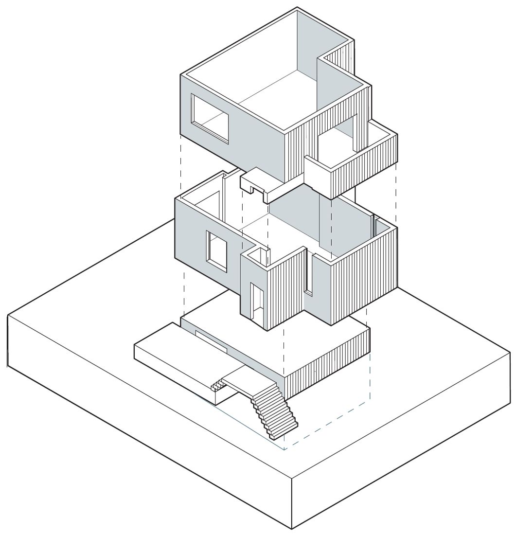
IsometricBathhouse
Hostel loungeHostel common area
I designed the building in Rhino, drew the plans, sections and isometrics in Illustrator and Photoshop, and used Rendair AI to support the rendering process.
Reflection
The project was well received at final review. The main feedback was to push the ribbon further: how else could it interact with the existing building and with the people using it, so it becomes even more central to the design? If I did it again, I would spend more time on the bathhouse itself and make it more intuitive for visitors to move through.
Spatial reasoning that turns ideas into buildable designs
Designing within real physical constraints
Designing with the needs of the people who use the space in mind
UX designer
A systems view of how a product fits together through user research.
User-centric and behavior-driven design
Coding experience that keeps my designs realistic to build
AI designer
Using AI to explore and refine design ideas and workflows
Building coding projects to understand design betterJust getting started
Using AI to actualise my designs, iterate and further my design capability
Resume
Education
Carnegie Mellon UniversityExpected May 2028
Pittsburgh, PA
Bachelor of Arts in Architecture
Additional Major in Human-Computer Interaction
Minor in Innovation and Entrepreneurship
Work experience
UX Design & Consultancy InternJune to July 2026
Ernst & Young, New Delhi, India
Led end-to-end UX research and design for a client project, developing user research methodology (surveys, interviews, empathy mapping) that informed design direction and stakeholder alignment.
Applied a research-first approach to an independent project exploring e-book discovery in fragmented Indian markets, creating IA and task flows based on user insights from four user personas.
Translated research findings into high-fidelity prototypes and design systems using Figma for project deliverables and design documentation.
Architecture InternDec 2023 to Jan 2024
Morphogenesis Architects, New Delhi, India
Supported a small architecture team working on a school building located in New Delhi, India.
Performed preliminary research based on existing sustainable precedents to assist in naturally insulating the facility. Participated in team meetings to ideate for the building project.
Utilized software such as AutoCAD, Illustrator, and Photoshop to create site plans and experiential renders for client presentation and approval.
Social Initiative Co-founderJune 2020 to July 2024
Utopia, New Delhi, India
Co-founded a social enterprise upcycling garment manufacturer scraps into accessories for teenage girls; reinvested sales profits to produce reusable cloth sanitary napkins, distributing 2000+ units at no cost to underprivileged girls in rural India through a partnership with the NGO ‘Farm to Food’.
Built and managed a full e-commerce operation including website development, creative direction, photography, product design, and quality control; produced initial prototypes to guide NGO mass production.
Managed supply chain coordination between garment factories, production facilities, and NGO distribution partners, ensuring timely delivery across multiple locations in India.
Additional experience
Tartan AmbassadorSep 2026 to present
Enrollment Management Division, Carnegie Mellon University, Pittsburgh, PA
Lead campus tours for prospective students and families, presenting Carnegie Mellon’s academics, culture, and student life to 10-20 visitors at a time.
Represent the university as a student voice, answering questions on programs, housing and applications, adapting content and conversation to each audience. Using public speaking skills to engage with my audience.
3D Crafts Booth StoolJan to May 2026
Alpha Phi Sorority, Carnegie Mellon University, Pittsburgh, PA
Applied 3D design skills using Rhino, AutoCAD, and Adobe Creative Tools to create designs for Alpha Phi sorority’s booth structure. Used digital fabrication (CNC mill, laser cutting, 3D printing) and woodwork skills to execute 3D crafts. Worked with a team of sorority members to assemble, refine, and create exclusive designs.